
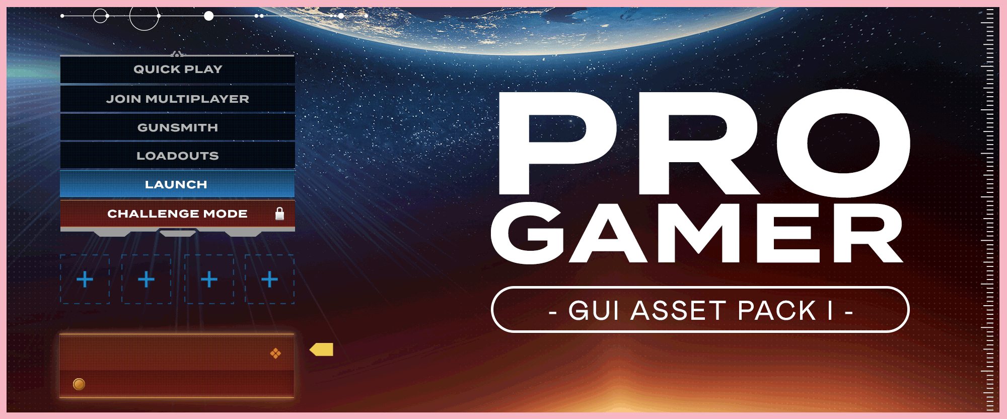
Game UI Design in Adobe XD can be a great addition to your portfolio. Especially if you turn them into a case study with both UX flows and the UI designs. In this tutorial, we will be making a full UI Asset pack for a computer game, that you can use in other projects. So whether you are looking for a quick start guide in Adobe XD design or you have bigger plans involving Unreal Engine or Unity. This Game UI Design guide will get you started on your journey to designing Game UI in Adobe XD.
On a deadline? Buy the Game UI Design Asset Pack
Now there will be some of you who just want the asset pack. You’ve got a project and need some cool UI elements to add-in. It’s ok, I have been there! Buying asset packs can be such a time saver and adds a professional touch to your projects. So Click Here to buy this Adobe XD Game UI Design Asset Pack – I would love to see what you create with it.
Now for the rest of you who want to build the asset pack – let’s get started!
Design the Default Game Menu
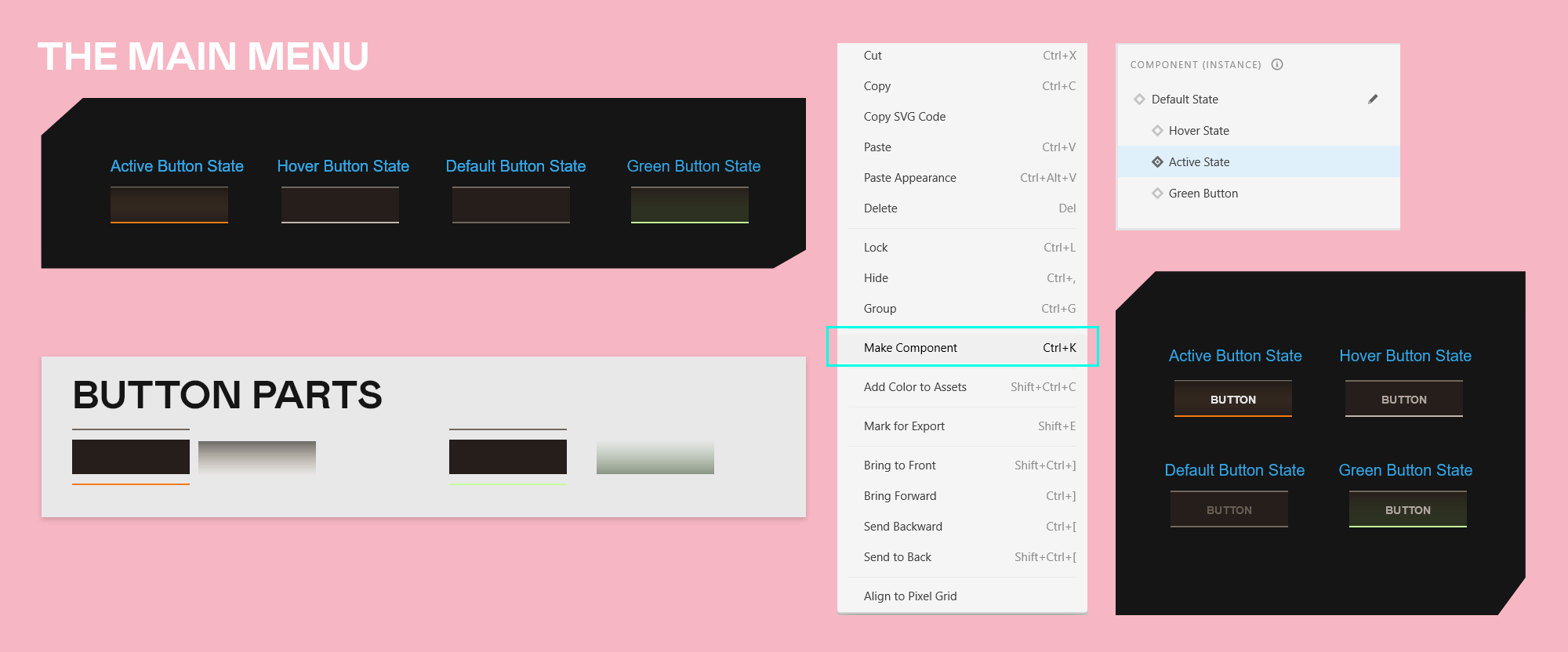
As you can see, I have created four states for the menu. Default, Hover, and Active. Let’s start by building out the Default State of the menu.
Step 1: The background Bar
For the main background bar, draw a rectangle, and then set its width to 150px and height to 44px. This will be a menu button.
Set the colour of the rectangle to #261E1B.
Now draw another rectangle, set the width to 150px and height to 2px. We will duplicate this, CTRL-C and CTRL-V, so that we have two of them. Place one along the top edge of our rectangle and the other at the bottom. Select both, and set the fill to #70675E
Step 2: Create Components
Select just the main rectangle and the two thin rectangles which run along the top and bottom. Right-click and go Make Component and then call it ‘btn-main-menu’.
Step 3: Hover State
Depending on your developer will depend on how they like to receive their UI files. Some developers want everything laid out so they can clearly see each state. Others are fine to have the states be within the components. If in doubt, ask your developer what they require from you.
We will do both.
So select your btn-main-menu button. If you look to the top right of Adobe XD you will see Component Main, Default State, with a little plus icon next to it. Click that plus and select Hover State.
Make sure Hover State is selected and then double click into the button design, select the bottom bar and change its color to #C1B7B0
Step 4: Active Button State
Go back up to the Component Main and add another State, call it Active. Again select the lower bar and then change its color to #F57B11
Make a duplicate of the main rectangle – we will make a subtle orange glow. This duplicate sits directly on top of the main rectangle. Set the Fill to Linear Gradient. Select the far right gradient circle and change its color to #846643 and set the Opacity to 0%. Select the far left gradient circle and set the color to #1A1612 and the opacity to 60%.
Step 5: Green State
On the Component Main, create a new state and call it Green State.
Click into the component until you can select the main rectangle, duplicate it so you now have a new rectangle sitting directly on top of the previous one.
Set the fill to Linear Gradient, click the far right circle, and set the color to #2E4224, and set the opacity on the right of the color wheel to around 50%.
Click on the left-hand circle and set the color to #5C8448, and set the Opacity to 0%.
Select the lower thin bar that runs along the bottom and set the fill to #C5FF99
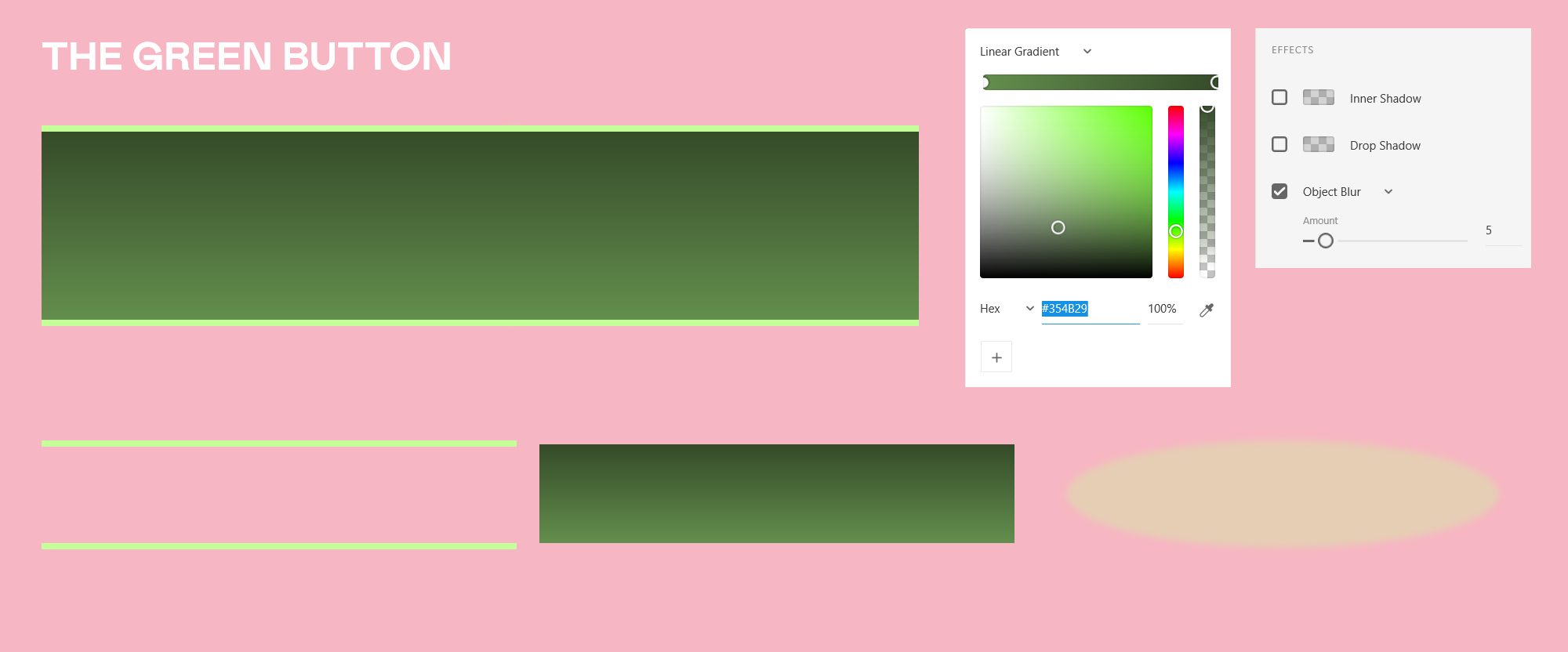
Step 6: Create Green Button
The green button hangs below the menu. This could be a useful signifier that a menu item has an additional effect or value to it.
Draw out a rectangle and set the width to 150px and height to 23px. We will use a gradient for the Fill. So click the Fill button, from the drop-down select Linear Gradient.
Click the far-right circle and set this color #354B29, and then click the far left circle and put in #648F4E. So now we have a soft green gradient that goes from dark to light.
Add a thin rectangle, set the width to 150px, height to 1px and colour to #C5FF99. Make a duplicate of it and place one at the top of your green button and one at the bottom. This adds to the Glow effect. To further the glow a little more, create an ellipse over the green button. Set its color to #C5FF99, set the Opacity to 33%. Then if you look down the panels on the right-hand side you will see a tick box for Object Blur. Click that and set it to 5 to give it a soft edge.
Select the Green Button, Right-click it and go Make Component. On the left-hand side of Adobe XD you will see the Asset Panel which has the Colours, Character Styles, and Components. You should now see your new Component, right-click to rename it. I am calling mine ‘btn-green-top’. The great thing with using Components is that if you wanted to change the color of it, you could right-click the green button in the component list and select Edit Original, make any changes you wanted, and then it would automatically update those changes to every instance of the green button. This is really useful if you are using elements across multiple screens and menus.
Step 7: Check the states
Now you can click through the Default State, Hover State, Active State, and Green State of your main menu button. So you can see what they all look like. I also want to lay these out on to the XD artboard and clearly label them. So that the developers can easily see what the states are without digging through the XD menus.
Duplicate the button three times so that you have four of them in a row. Using the States you have just set up, set one to Default, one to Hover, one to Active, and the last to Green. Then write below them Default, Hover, Active, green. I find it’s always better to be as clear as you can be when laying out a UI Kit. You can also include an example mockup of how the green button would look with its lower component attached.
Step 8: Add the Text
Let’s add in our text – this is a mockup to show the developers what the button would actually look like when used. I am going to use the font Arial. This is probably the most boring of all fonts, but I wanted the asset pack to be accessible to all without having to package up fonts. So please do choose something that you think will be cooler to use!
For the button’s text I will just put the word Button. My text settings are Arial, 14 Bold, Line Spacing 16, Centered Aligned, then in the Transform Panel, set the width to 150px. This is the same width as the button and makes sure that your text is perfectly centered in the button at all times.
Active Button Text: #FFFFFF
Hover State Text: #C1B7B0
Default State Text: #7067SE
Green State: #C1B7B0 and #FFFFFF
I don’t want to include the text in the Component itself as the Developers would add that within Unity or Unreal, but it’s useful to see what the button would look like with the text variations.
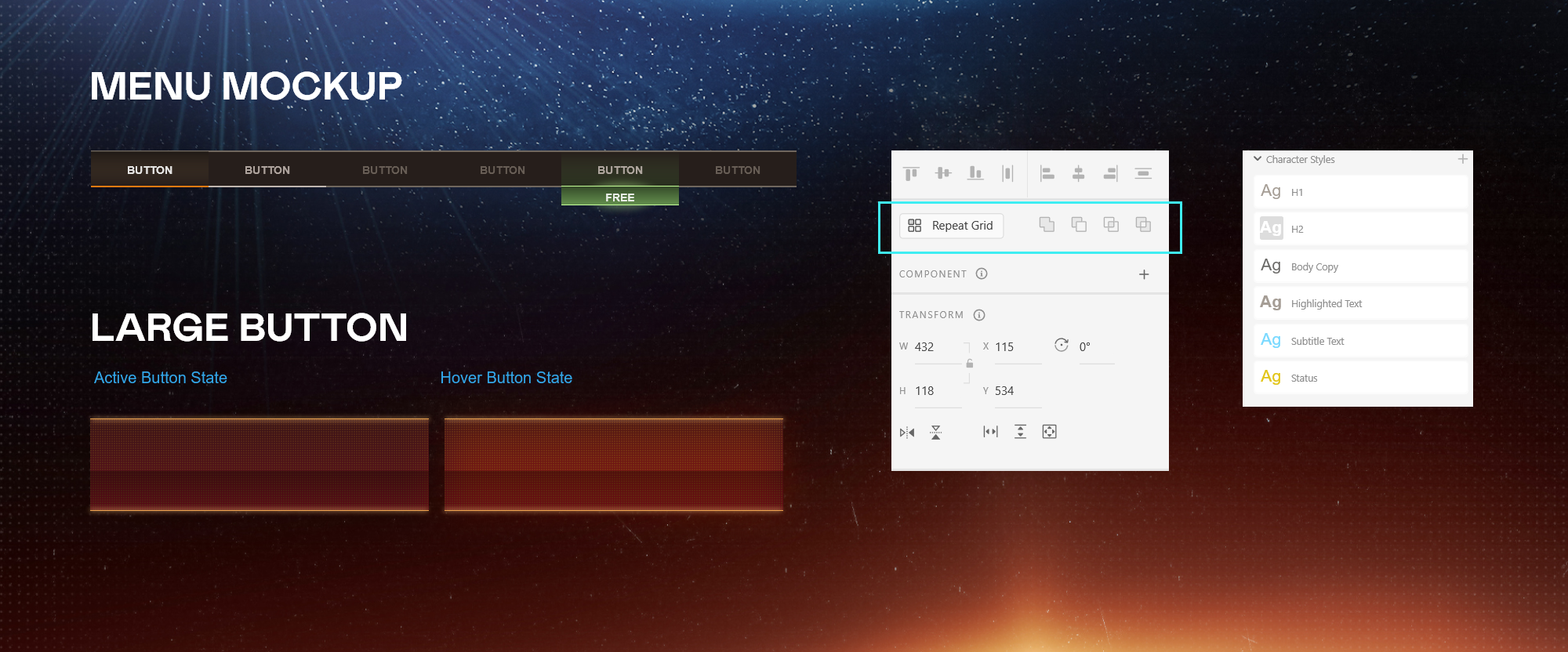
Menu Mockup
Last thing to do is to duplicate the buttons and move them so that they sit alongside each other so we get a sense of what the actual menu will look like.
Large Button – Step One: Default State
Let’s create a large button that has a little texture to it. Create a new rectangle with the Width 432px and height 48px. Set the Fill color to #031623
Now let’s make the texture part. Create a rectangle and set the Width and Height to 2px, turn off the border. Now click Repeat Grid, and drag out the green handles so that you can see the squares being repeated. Change the distance between the squares to 1px in both horizontal and vertical directions. Now set the color to #000000 and layer the squares over the main rectangle.
Now make this button a Component – Right-click Make Component.
Step Two: Hover State
On the top right in the Component Main – Add a new state Hover. Now move the texture squares a little so that you can get at the Main Rectangle behind them. We will change the fill colour to a Linear Gradient. Select the far right gradient circle and enter the color #216EB9 select the far left gradient circle and set the color to #0A2941
Select the squares pattern and set the color of the squares to #64A6cc then set their opacity to 26%
Make sure you have double-clicked into the component and then make a rectangle, turn off the border, and set the width to 432px and height to 1px set the color to #3CA6CD duplicate it and add one bar on the top of the main rectangle and one on the bottom.
Step Three: Active State
Now add a new state and call it Active State. Select the squares texture and set the color to #5E3117 and set the opacity to 67%
Move the squares down a little so that you can click on the main rectangle background. Change the Linear Gradient to these colors: The far-right circle should now be, #650D1B and the far left circle should be #391417
Change the thin rectangles to be the color #CD843C
Step Four: Duplicate the buttons
Now we duplicate the button twice so we now have three buttons in a row, set them to Default, Hover and Active. Then Label them.
Select all three and duplicate them again – we will add text so that we know what they should look like once in the game engine.
Default Button: Arial, 24, Regular, Left Align, Color: #597985
Hover Button: Arial, 24, Bold, Left Align, Color: #7EF3DC, duplicate text and then set Object blur to 5 and Opacity to 87%
Active Button: Arial, 24, Bold, Left Align, Color: #F3D57E, duplicate text and then set Object blur to 5 and Opacity to 87%
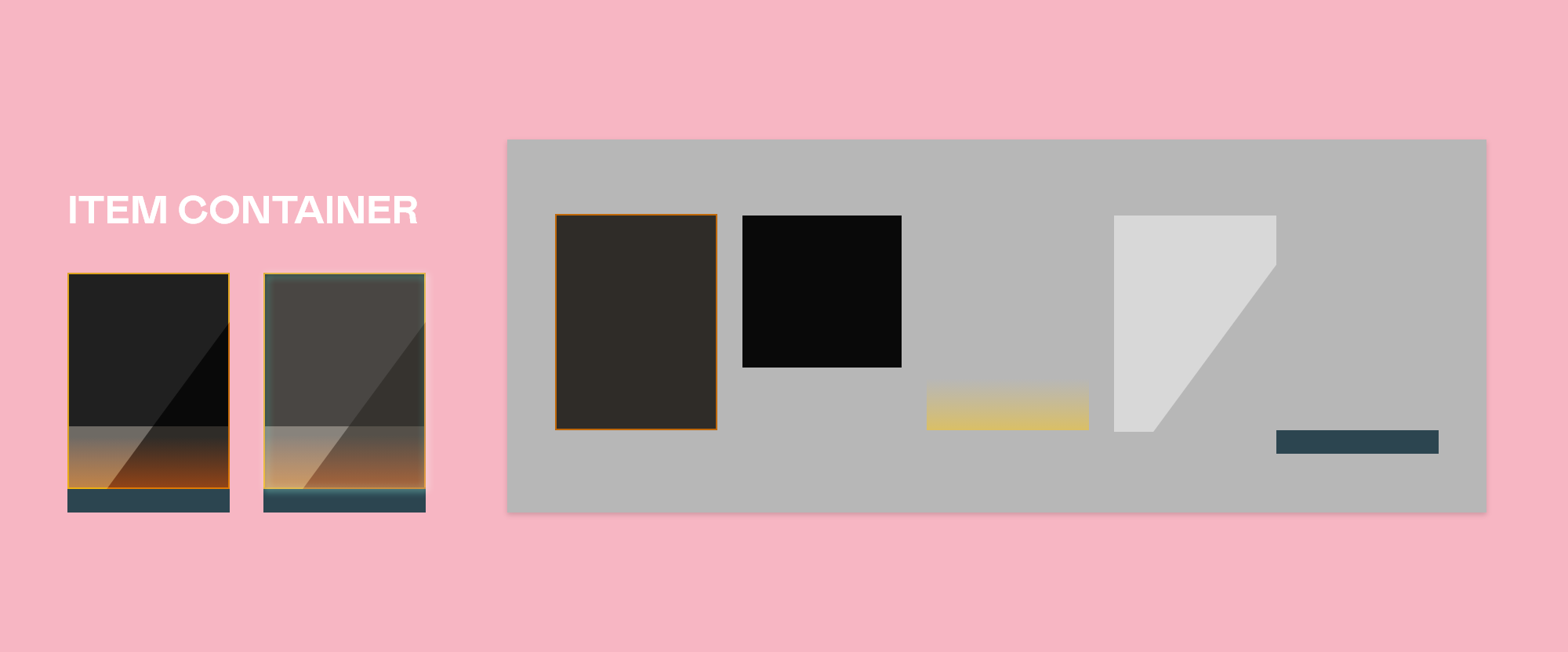
Item Container Design
This is a fun little container that can be used to hold various items for your game. It’s built out of rectangles, using blend modes to create the shines and object blurs to give the soft glows.
Step 1: The main rectangle
Draw out a rectangle and set the width to 207px and height to 276px
Set the fill to #2F2C28 and the border color to #06809 set the border size to 2
Now make another rectangle and set the width to 203px and height to 194px, place this at the top of your first rectangle so that we still see the orange border surrounding it
Step 2: Orange Glow
Duplicate the main rectangle.
Set the Opacity to 54%
Set the Fill to a Linear Gradient. The far-right gradient circle should be #F39B16 and the far left should be #E9982B and then set the opacity of this to 0%
Now layer this orange fade over the main rectangle. We only want the orange glow at the bottom of the design, so by clicking in the Fill button you will now see a white gradient control appear on the orange glow shape, draw the top of that white control down so that it sits a little below the darker rectangle. Now set the blend mode to Hard Light.
Step 3: Shine
Now duplicate the main rectangle again. Set the color to solid white. and the blend mode to Soft Light. Now double click into this shape. You will see white corner points that you can move around. Grab the bottom right white corner, and drag it to the left. Hold shift while doing so to keep the direction locked flat. Place this white corner about 50px from the left corner.
We can add another control point by clicking on the edge. So click on the right-hand side edge to add another control point and then move that so it sits directly under the top right corner – about 50px below it. Take a look at the reference image to see the kind of shape you should now have.
Put this shine layer over the design.
Step 4:Bottom Bar
This one is pretty simple, it’s just a solid bar that we can add text to. Make a rectangle, set the width to 207px height to 30px, and set the fill color to #2C4550. Place this below the main design.
Step 5: Component
Select the whole box and right-click and select Make Component. Now add another state by going top right Component Main: click the plus icon and add a Hover State.
Double click into the component. Select the main rectangle and make a duplicate of it – we will make this into a soft outer glow. Set it’s blend mode to Screen. Set the Fill color to Off. Set the Border color to #57FFE3 set the size of the border to 2. Now set the Object Blur to 5 so we get a nice glow. If you only see Background Blur then select Object Blur from the drop down.
Layer this back over the design.
Message Box Design
This message box is fairly straightforward and uses the same design concepts that we have used in the previous designs.
Create a rectangle and set the width to 306px and the height to 100px and color to #2C2822.
Duplicate this rectangle and then set the width to 4 and height to 101px, and the color to #F47B12 and place it to the far left of our main rectangle.
Duplicate this orange rectangle and set the width to 2px and height to 99px. Set the color to solid black and place it on the far right of the main rectangle.
Make a duplicate of this black rectangle and set the width to 307px and height to 2px. Have this run along the bottom of the main rectangle.
Step 2: Box Texture
We will have a texture that runs over our main rectangle. Create a rectangle and set the width and height to 24px. Click Repeat Grid and drag it out. Set the distance between the squares to 2px. Place this over your main rectangle and adjust the size so that it fits nicely over the top.
Step 3: Make Component
Select the design and right-click Make Component. If you want some variations you can make two duplicates and then double click into one of the duplicates and set the orange bar’s color to #C169F2 and then do the same for the other duplicate but set the color to #2C87BA
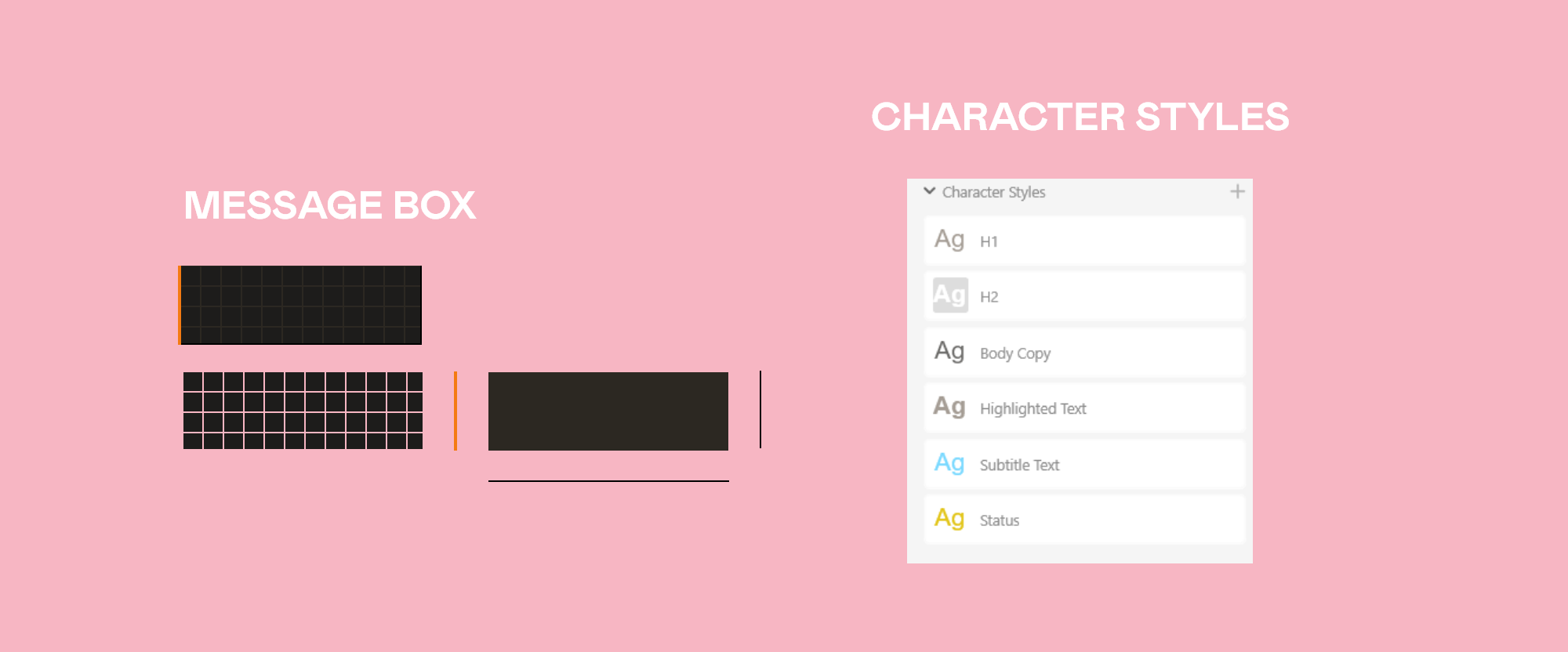
Character Styles
Setting up the Character Styles in Adobe XD makes writing copy far faster as you won’t need to dive into the text menus to change various settings each time you make a new piece of text.
I will be using the font Arial – as I said earlier, please do choose a more interesting font! I am only using Arial as I want to have this file as a downloadable resource and I want to have it as accessible as I can.
Let’s make a H1 headline. Write the word Headline. Set the font to Arial, size to 36 Regular, Character spacing to 50, Line Spacing to 42, Left Align. Color set to #A59D95
To add this as a Character Style, click into the Document Assets list – you can find this on the bottom right of Adobe XD, its the top of three vertical icons. With your text selected click the plus icon where it says Character Styles – rename it H1.
Headline 2 or H2: Duplicate your text and change the settings as follows: Arial, 24, Bold, Character Spacing 50, Line Spacing 28, Fill color white. – Save this in the Character Styles and rename it H2.
Body Copy: make a new duplicate and change the text settings to, Arial, 14, Regular, Character Spacing -30, Line Spacing 16 and fill to color to #6A6967 – save this in your Character Styles and rename it as Body Copy.
Highlighted text: Duplicate a piece of text and change its settings to: Arial 14, Bold, Character Spacing -30, Line Spacing 16, Fill color #A59D95 – save to your Character Styles as Highlighted Text.
Subtitle Text: Duplicate a line of text and change the settings to as follows, Arial 14 Regular, Character Spacing -30, Line Spacing 16, Color #79D9FF – Save to Character Styles as Subtitle Text.
Status Text: Duplicate a line of text. Set to Arial 14 Regular, character spacing -30, line spacing 16 and fill color to #E2C518 – Save to Character Styles as Status Text.
Now you can write any copy you like and quickly change the formatting by clicking on any of the Character Styles you have set up. This makes it quick and easy to fill out your designs with text that sits together cohesively.
So now you have a variety of buttons and panels to get you started with your own designs. Remember you can get the full Game UI Asset Pack which you are welcome to use in any way you see fit.
Looking for another Tutorial?
How about trying your hand at a Photoshop tutorial all about Smart Objects. This tutorial will show you the best way of creating mockups with Smart Objects in a professional way. This is a great technique to show in your design portfolio, so be sure to check it out! Click here to learn more about Smart Objects.